Return on investment for users

This is part of a series discussing our practices and values in the context of unemployment insurance modernization with the US and NJ DOL.
Now that we’ve described how this process works internally, how does it all impact the people who will use the software we’ve built? What’s the bottom line improvement for all this process?
As Usability.gov summarizes, the return on investment (ROI) for UX throughout the development process, especially early on, is a function of employee cost and the number of problems they’d have to fix that could have been caught early on through design methodologies. We’ve employed design best practices throughout this project and want to highlight a few key points:
Centering equity and accessibility
A more sustainable and scalable platform
Reducing agent intervention
Centering equity and accessibility
Human-centered design is at the heart of Truss’ strategy across all our work, and we’ve employed many of the suggestions from The Century Foundation in our product strategy with the DOL. We try to take that further with design justice: centering people often marginalized and disproportionately affected by the forces at play. Through our primary and secondary research, we compiled a number of inequities that we were able to address to some degree in our work and shared that with our NJ DOL partners. Two key areas we were able to make significant improvements in were accessibility (sometimes referred to as “a11y”) and plain language, which are correlated.
Accessibility technologies are well supported by most computers and browsers, making them fairly easy to integrate with. Therefore, we have ensured through early design and subsequent manual and automated testing that all pages are optimized for those tools. We’ve tested on every code change that both JAWS and Mac Voiceover screen readers work equivalently, that people can scale text and elements and use magnifiers well, and that all content is accessible through mouse, keyboard, and other input devices. We have also checked that colors are optimized for contrast and different types of colorblindness, and we’ve avoided any visual patterns that may cause confusion or other negative cognitive effects.
Plain language is a related component of cognitive accessibility, as well as a major federal and state goal in any modernization work. The greatest challenge is in reducing complexity while preserving some more complex terms that are unique to UI or legally required. To strike the right balance, we kept a tight feedback loop involving content designers and subject matter experts. A few ways the new application achieves this:
Replaces jargon to reduce confusion
Makes questions easier to translate
Simplifies questions and answers to avoid extraneous “helper text”
Where helper text is unavoidable, focuses it on instructions and examples
Pages are reduced in length to reduce the cognitive load of each step
Breaks apart complicated questions into multiple simpler ones, conditionally showing subsequent questions only if necessary
Allows text to be translated more directly and easily, potentially increasing the speed of such work and reducing the chance of critical information being “lost in translation.”
We’ve tested our accessibility and plain language work early and often with both claimants and project personnel (NJ, Truss, and USDS). There are guidelines available on the USWDS website for how to continue this pattern in the application as the legal rules change, and we recommend designing new improvements with marginalized people in the process to continue this work.
Finally, focusing on accessibility and equity raises the bar for everyone; it rarely only benefits people who require the measures. Instead of looking at an accessibility effort as helping, say, “only 3% of the population”, consider that it actually helps 100% of the population at least a little and 3% of that even more. For that reason, we take an equity-centered approach, which translates to near universal improvement to the platform.
A more sustainable and scalable platform
Our goal for this project was not just a cosmetic improvement to an existing system, but a fundamental shift to modern software development. We built for today and for the future, focusing on adaptability, scalability, resilience, and security. For UX, that means taking advantage of established design systems and mobile-first design.

Try the U.S. Web Design System
We created a project-ready React implementation of the USWDS and used it in this project. Download it from our Github repo, and consider reading some key benefits of using the USWDS in your work.
Perhaps most obvious is the visual design based on the New Jersey Web Design System, which itself is based on the aforementioned US Web Design System. Both are well supported on their own, which allow public entities like the Division of Unemployment Insurance to modernize their visual design with minimal long-term maintenance costs. That includes mobile-first design principles including responsive behaviors and navigation, similar to what their form already had. However, where that was mobile-friendly in many aspects, USWDS takes a mobile-first approach in the same way we took an equity-centered approach to this project.
A mobile-first approach goes beyond automatically resizing the navigation for all sizes of screens. It means assuming a mobile device as the most common (and growing) device for accessing this form, and scaling up from there, rather than taking a desktop-optimized application and scaling down. We’ve also allowed for claimants as they fill out the form to go back to a previous page to change their responses. On SSI, there is only a “back” button, whereas the new platform allows for direct navigation to particular pages. This is particularly effective from the review page to quickly fix an error. We’ve also specified in each input field how to render virtual keyboards on phones and assistive technologies. For example: showing a number-only keyboard for phone number fields. Pages are smaller in size and can be saved as claimants progress, allowing effective and efficient use on slow and spotty internet connections.

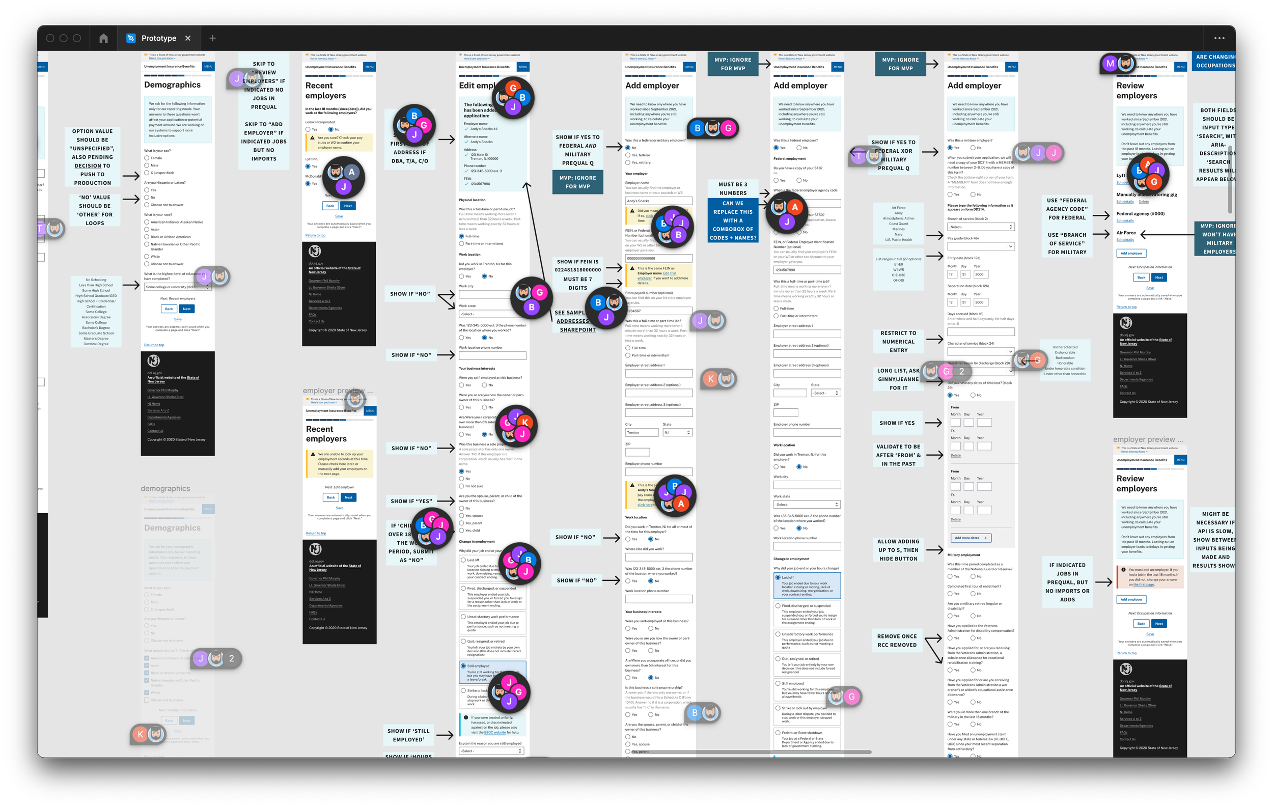
Screenshots of our prototype on desktop and mobile sizes
Reducing agent intervention
Generally, users don’t want to use a product or service, they want an outcome with little to no work. Our job as designers is to optimize the product or service that gets as close to that as possible. In this project, that often means working with “work-arounds” that many unemployment agencies rely on to bridge legal requirements and technical limitations. Sometimes the UX of that workaround was helper text telling a claimant to enter a seemingly arbitrary number into a field, because that means something to the agents who would intervene in their claim manually. However, our work was to ameliorate this UX side, for example by replacing that helper text with a simple yes/no question, which the system uses to automatically inject that arbitrary number behind the scenes, so that the agents get what they want without telling the claimant to do something that might seem fishy.
By orienting the form’s design to the claimant and their understanding—rather than to the legal and technical rules for UI—we hypothesize claimants will make fewer mistakes. This results in fewer agent interventions, which means faster claims and lower admin cost. With the ability to save their progress, claimants can take extra time to ensure their responses are correct before a timeout, reload, loss of power/internet, or any other interruption. Showing/hiding questions conditionally reduces the cognitive load of claimants and streamlines their workflow, reducing the chance for errors.
Throughout our work, we sought the advice of subject matter experts in policy and programming about what is most likely to cause agent interventions, and we designed ways to avoid or optimize those scenarios. We gathered feedback from claimants through the current questionnaire and our own studies and found that much of the support call volume comes from users checking the status of their claim. While we created end-to-end prototypes for the website and coordinated with NJ Communications personnel on email, mail, and phone correspondence, we were unable to push code changes in the scope of this project. However, we have full confidence in future projects, with or without Truss, being able to use our designs in Figma and corresponding Github issues describing the work to bring that to fruition.
A screenshot of our Figma prototype, showing lots of comments from our stakeholders in context to streamline communication and feedback.
Frequent improvements that are less disruptive for everyone
Easily overlooked and often taken for granted is the ability for an organization to update and improve the user experience frequently and with minimal disruption. By building a foundational practice within NJDOL of evaluating incremental changes in-context with the systems they would impact, coupled with a powerful CI/CD pipeline, NJDOL will be able to release updates both large and small as frequently as they desire.
Gone can be the days of releasing large updates that only come a few times a year (and can often fail before they can even be used by claimants).
Do options need to be added to drop-down menus? Done.
Is an additional language translation of the site ready to be used? Make it so.
Does one way of wording a question lead to more accurate responses? Test it and see.
By embracing Agile processes like Acceptance Testing, incremental releases, and even splitting traffic between two versions of a piece of the site, NJDOL will be able to adapt to the most-pressing needs of their claimants, as well as maintain a more secure application than ever before.
Best of all, it means that site downtime will be limited (often eliminated). Pulling all-nighters to release and test the latest updates—hoping everything is working correctly by the time claimants begin visiting the site for the day—are a thing of the past.
Does this sound familiar? Is your team trying to make a case for UX? Truss can help. Please let us know what questions you have. We’d be happy to jump on a quick call and open up the conversation.
This is part of a series discussing our practices and values in the context of unemployment insurance modernization with the US and NJ DOL: